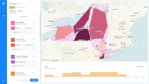
Our job was to make a filter by column analysis within the studentorigins layer so that we were able to only see students from the state of New York. In addition to that, we also made a polygon analysis that split the groups of incoming students into five groups. Within this polygon analysis we edited it’s features to show pop- up displays of the amount of students enrolling from each group. All one must do is simply hover their cursor over the desired polygon to see it. The purpose of this map is to illustrate the changing population of each stationary polygon in order to see any peculiarities.
The following link is to the CARTO Map:
https://grantboyd.carto.com/builder/e07dd3c6-8194-4158-af51-283799c274f0/embed
While using the timeline we were able to witness significant changes with the northwest polygon from the between the year spans of 1850-1854 and 1855-1861. The population of enrollment from this particular polygon went from 19% to 9% in this time gap.
Only speculation can say, but we believe that the possible cause of this is due to the “scandal” that occurred with an African American Professor marrying a Caucasian student. This event received a lot of press which could have had influenced the people within this area of the polygon to not go to the college in McGrawville. This exact influence we are talking about is the Syracuse papers, since they were known to have a racial bias in their area. Some papers even displayed illustrations that were meant to cater against mixed racial marriages (the words they used were miscegenation and amalgamation).
Overall, I think what we learned from this specific project is how visual/digital mapping can help correlate data with certain events, situations, and mysteries that we wouldn’t be able to pick up on otherwise.
– Grant Boyd and Grace Staudt

